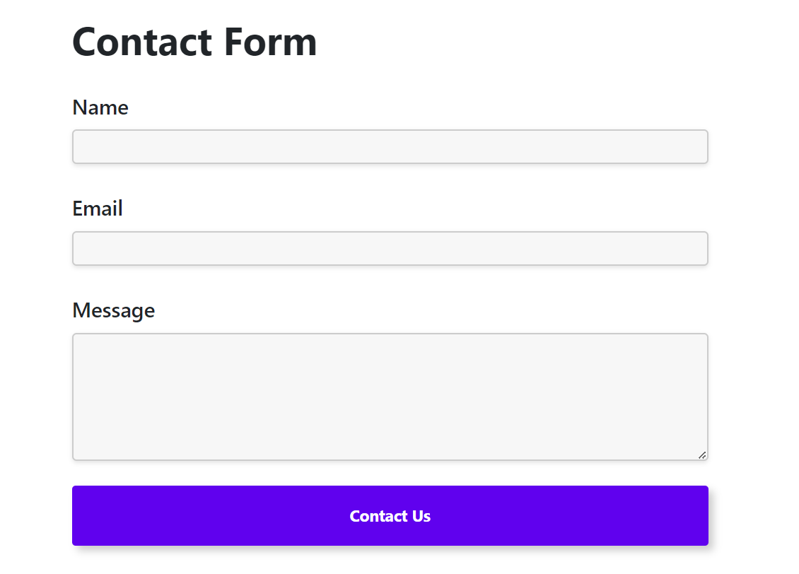
A well-designed contact form is more than a simple communication tool—it’s a gateway to converting visitors into customers or leads. Whether you’re running a blog, e-commerce site, or portfolio, an optimized contact form can boost engagement, build trust, and improve conversion rates. This guide will walk you through the best practices and tips for creating a high-converting contact form, highlighting the innovative features of Yoo Forms, a powerful WordPress plugin designed to simplify the process.
Understand Your Audience’s Needs
To create a contact form that converts, start by understanding your audience:
- Why are they contacting you? Determine common inquiries, whether it’s support, sales, or general questions.
- What information do they need to provide? Avoid overwhelming users with unnecessary fields.
Yoo Forms Insight: Yoo Forms offers a user-friendly interface to create customized forms that cater to your audience’s specific needs.

Keep the Form Simple and Focused
Simplicity is key to encouraging form submissions:
- Limit the Number of Fields: Include only essential fields like name, email, and message.
- Group Related Fields: If your form has multiple sections, consider grouping fields logically for better clarity.
- Use Placeholder Text: Guide users on how to fill out the form with placeholder text.
Pro Tip: Yoo Forms allows you to add tooltips and placeholder text, making it easier for visitors to understand what’s required.
Optimize Field Labels and Validation Rules
Field labels and validation rules play a critical role in user experience:
- Clear Labels: Use descriptive labels like “Your Name” instead of just “Name.”
- Real-Time Validation: Inform users immediately if their input doesn’t meet the criteria.
- Set Required Fields: Ensure fields like email and message are mandatory for submission.
Yoo Forms Feature: With Yoo Forms, setting required fields and customizing validation rules is a breeze.
Ensure Mobile Responsiveness
In today’s mobile-first world, ensuring your form works seamlessly on all devices is essential:
- Responsive Design: Test your form on smartphones and tablets.
- Clickable Buttons: Make the submit button large enough to tap easily on smaller screens.
Yoo Forms Advantage: Yoo Forms automatically creates responsive forms that look great on any device.
Add a Clear Call-to-Action (CTA)
Your form’s CTA should encourage users to take action:
- Use Actionable Language: Instead of “Submit,” try “Send Your Message” or “Get in Touch.”
- Position Strategically: Place the CTA button where it’s easily visible, preferably below the form fields.
Offer Incentives to Engage Users
Give users a reason to fill out the form:
- Free Resources: Offer a free eBook, discount code, or consultation in exchange for their contact information.
- Quick Response Promises: Highlight that you’ll respond within 24 hours to encourage trust.
Pro Tip: Use Yoo Forms’ autoresponder feature to send a personalized confirmation email immediately after submission.
Use CAPTCHA to Prevent Spam
Spam submissions can clutter your inbox and waste time. Protect your form with:
- CAPTCHA or reCAPTCHA: Verify users are human before submission.
- Honeypot Fields: Add invisible fields to trick bots.
Yoo Forms Security: Yoo Forms includes robust anti-spam features like CAPTCHA to ensure only genuine submissions come through.
Test and Optimize Your Form Regularly
Continuous testing is crucial to maintain high conversion rates:
- A/B Testing: Experiment with different field arrangements, colors, and CTAs.
- Analyze Performance: Use analytics to track submission rates and identify drop-off points.
Provide a Thank You Page or Message
Acknowledging a user’s submission builds trust:
- Redirect to a Thank You Page: Use this page to provide additional resources or next steps.
- Show an Inline Message: Confirm submission directly on the form page.
Pro Tip: Yoo Forms allows you to customize thank-you messages, ensuring a personal touch.
Design for Accessibility
Ensure your form is accessible to all users:
- Keyboard Navigation: Allow users to fill out and submit the form using only a keyboard.
- Screen Reader Support: Ensure labels are properly associated with their respective fields.
Yoo Forms Inclusion: Yoo Forms is built with accessibility in mind, ensuring compliance with WCAG standards.
Convert More with Better Contact Forms
Creating a high-converting contact form is about more than just aesthetics—it’s about understanding user behavior, minimizing friction, and building trust. Tools like Yoo Forms simplify the process, offering customization, responsive design, and advanced features like CAPTCHA and autoresponders.
Follow these best practices to transform your WordPress contact forms into powerful conversion tools. With Yoo Forms, you’ll not only save time but also create forms that your users love.
Frequently Asked Questions (FAQs)
A high-converting contact form encourages users to submit their details by being simple, user-friendly, and functional.
Yoo Forms offers advanced customization, spam protection, and a responsive design, making it perfect for high-converting forms.
Use A/B testing and analytics to evaluate form submission rates and optimize based on user behavior.
Yoo Forms includes CAPTCHA and honeypot features to prevent spam effectively.
Yes, Yoo Forms allows you to personalize thank-you messages or redirect users to a custom page after submission.
Get Started with Yoo Forms Today!
Crafting a high-converting contact form has never been easier. Download Yoo Forms and start creating forms that boost engagement and conversions effortlessly.

Leave a Reply